Reading, evaluating, interpreting and describing diagrams is an integral part of numerous selection processes. These skills are not only in demand in the insurance industry and in commercial professions. Police officers and customs officials also have to be able to evaluate numerous tables, read diagrams and evaluate them correctly. Therefore, the following exercises are relevant for applicants, who want to prepare for their numerical reasoning test.
Common chart shapes and use cases
Here we present the possible uses of the most common chart shapes.
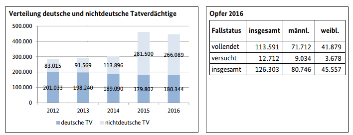
Bar charts / column charts

A bar chart is very similar to the column chart. It is good for comparing 3-15 one-dimensional values with each other. This can be e.g. the sales development, the growth rate of certain characteristics or similar. With a stacked bar chart / area chart, the relationships can be shown very well in addition to the development.
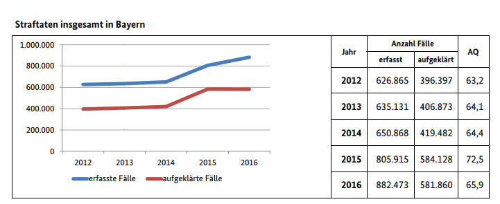
Line charts

To illustrate more than 15 values, the line chart is usually chosen. In particular, developments over certain periods of time can be mapped very well. The upper limit can be as high as you like, so hourly developments can even be mapped over very long periods of time. This is exactly why numerous web analysis tools prefer this form of diagrams.
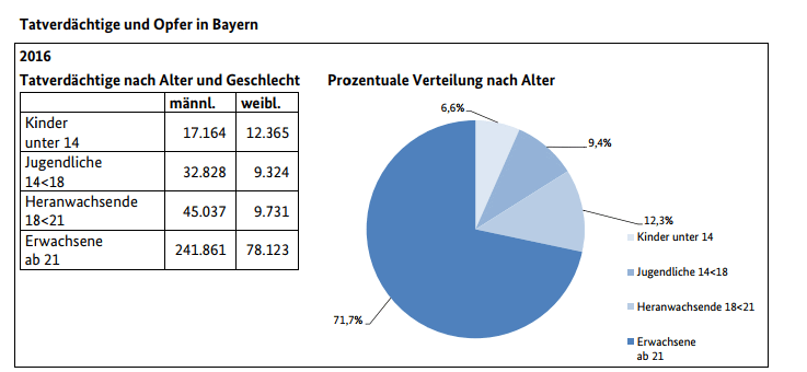
Pie charts

The pie chart is often used to illustrate a distribution of shares. It is not uncommon for the pie chart to be displayed in the form of a pie chart or pie chart (for election results). After the election results you often see a semi-circular diagram.
Evaluate diagrams in the aptitude test
In order to analyze a statistical evaluation correctly, you should ask yourself the following questions at the beginning:
- Which diagram form was chosen and why?
- Which core statement should be illustrated with the diagram?
- What place and time period does the data refer to?
- Which source is mentioned and how meaningful is it?
- In what order and on what scale is the data reported?
- Which connections are made clear?
- Can developments be identified? If yes, how do you explain them?
- Is there an attempt to distort / sugarcoat certain facts based on the presentation?
Once the data, graphics and diagrams have been thoroughly analyzed, the questions can be addressed. However, caution should always be exercised when interpreting the statistical values. After all, it’s not for nothing that the popular saying goes: “Don’t believe any statistics that you haven’t falsified yourself.” And when it comes to visual stats, that statement is arguably even more true.
The following skills are put to the test in this type of task:
- Concentration
- Logical thinking
- Diligence
- Speed
- Mathematical understanding
Diagrams as means of speech in the language test
Reading and evaluating graphics, tables and diagrams is an important means of communication. Above all, in the selection process for classic and dual courses of study or at the Gothe Institute as part of the C1 German exam, diagrams, graphs and statistics have to be described using common language. Typical phrases are, for example:
- As a basis for the statistics / the diagram …. was chosen/appointed
- by a fifth / quarter / third / half
- In place two / three / stand / stands …
- decrease / remain unchanged / increase / stagnate
Start practising for your numerical reasoning test now!
The numerical test is an important part in many aptitude tests and recruitment tests. With a good preparation, you can gain a clear advantage in the exam and achieve a good result in the numerical reasoning test. For this we recommend our online test trainer, with which you can not only prepare yourself perfectly for your numerical reasoning test, but also for all other important test components, such as logical thinking, language and math.


